The Best Paint Color for Kitchen Cabinets
by
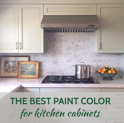
Is……..Mizzle, by Farrow & Ball. I’ve designed a lot of kitchens over the years, so when it came time to renovate my own I had a very clear idea of what I wanted. Everyone who comes into my house comments on the kitchen cabinets and how much they love them.

As much as I love a beautiful, all-white kitchen, my goal for this one was to find a cabinet color that had more life to it than white, but that didn’t stand out as a real “color” and still read as a neutral. My last house had “Green Blue” cabinets, also by Farrow & Ball, and I LOVED them, but that was a smaller kitchen in charming little beach cottage, and I was ready for a change to something more subtle and sophisticated. A great many photos that I pulled for general kitchen inspiration had gray cabinets, but going with a true gray in this particular house felt like it would be too drab for us. I needed to find a warm, light gray and I knew that Farrow & Ball was the place to start.


The great thing about all F&B colors is that they have more richness and depth to them than most other paints I’ve used. This color I used, Mizzle, seems to be constantly changing with the light, and looks different to different people, and different to me at various times of the day. I also love that even though it appears to be a mix of what are typically “cool” colors, i.e. gray, green and blue, it still has a really warm look overall. I had been hoping to find something that felt warm without going too beige, and this is it for me. It looks beautiful paired with so many different things: plain white, Carrara marble, Calacatta marble, stainless steel, and many other paint colors and accessories, both neutrals and colors. In my kitchen I used it with Carrara marble tiled backsplash (in 2×8″ running bond pattern), Carrara marble on the perimeter counters, and walnut butcher block on the island.


On my computer monitor, the close-up photo above of the desk area is more accurate than the photo below taken from the dining room, where it appears just slightly more green than it does in person.

It’s worth nothing that this company sells paint that is more expensive than some other popular brands. I think the price is well worth it in the grand scheme of the cost of a kitchen renovation. As ALWAYS with selecting paint for interior design projects, I suggest buying a small sample pot and putting it on a large sample board to move around and see if you love it in your own space and light before you commit to it. My personal feeling is that Mizzle looks much more green on the Farrow & Ball website than it does in my house in Palos Verdes. If it looks too green for you the great news is that there are so many pretty colors in this similar range from Farrow & Ball, and they make it so easy to order their colour cards and little sample pots!
NEED DESIGN HELP? I HAVE A NEW WEBSITE TO TEACH PEOPLE HOW TO DO INTERIOR DESIGN FOR THEIR OWN HOMES! Visit PLAN + ELEVATE to watch video tutorials, download exclusive resources and tools, and sign up for a personal interior design video consultation where you can get specific questions answered about your own rooms.
I’m available for hourly interior design consultations or art consultations in person in the South Bay of Los Angeles: Palos Verdes, Redondo Beach, Hermosa Beach, or Manhattan Beach.
Let’s keep in touch!
- Follow me on Instagram
- Follow me on Facebook
- Follow me on Pinterest
- Follow me on YouTube
- Visit my blog menu to see more posts
- Sign up for my newsletter
And share this post by clicking the icons below. Good luck with your design projects!
Anna
in the press

in the press