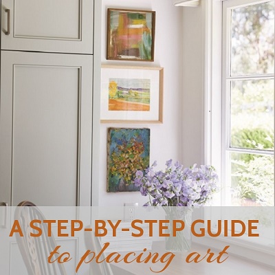
A Step-by-Step Guide to Placing Art
by
I recently lived through a kitchen renovation for the first time ever. I am so very thankful that we were able to do it, although the process was so nuts that I now have a new, first-hand appreciation of what so many of my interior design clients have lived through. W O W. I am so very thankful that it’s over. One of the great things about it is that I now have a much more functional work space that is a secondary part of the overall kitchen space. It’s very convenient (and noisy, and distracting, and full of snacks) and now sooooo much prettier! After so many months of planning and construction I was so excited to dive into my vintage art inventory and find the best paintings that I wanted to hang on the new walls. I decided to document the process because I go to so many interior design consultations and see houses with no art hung anywhere. I think people are paralyzed about where to start. Art placement is one of the hardest things to get right in interior design, but one of the most important.
In the houses I visit that DO have some art on the walls, one common issue that I see is that there is one small painting hanging all by itself, and it often looks swallowed up by the space. It just doesn’t do justice to the painting or to the room. I am a big proponent of stacking 2 or more small paintings vertically. There are so many great spots to do this…I plan to do a whole post on this soon. Here is my process for filling this tall but narrow wall space with art:

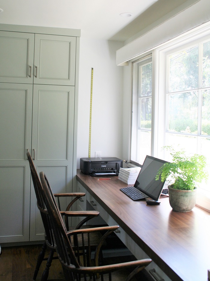
ABOVE: The “before” shot. I had an empty sliver of wall space in my office area of the kitchen that was begging for some attention.
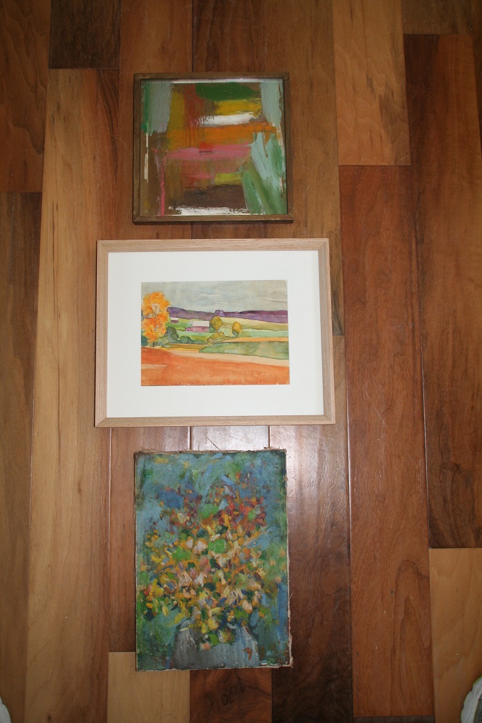 ABOVE: I reviewed dozens of paintings and narrowed it down to three that I thought (1) were relatively similar in size, (2) looked good together in terms of overall color – they all have a bit of green, light blue and orange, and (3) were an interesting mix of styles and mediums. Sometimes in a space like this I’ll hang 2, 3, or even 4 pieces that are very similar and part of a series, by the same artist, framed all the same way, but in this case I didn’t have something like that that I was dying to use, so I really wanted to make this spot eclectic and unique. After playing around with various positions for these three, I decided on this arrangement because the one in the center is wider than the others, and has a white mat, so it seemed most balanced to my eye.
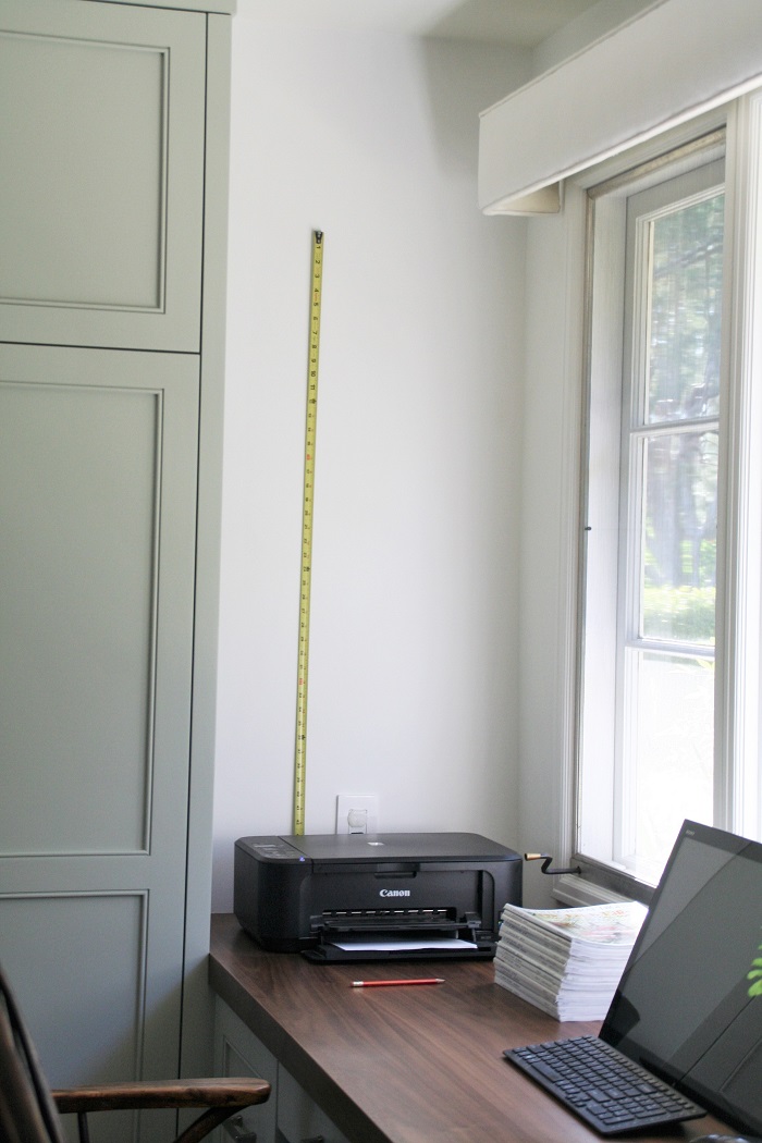
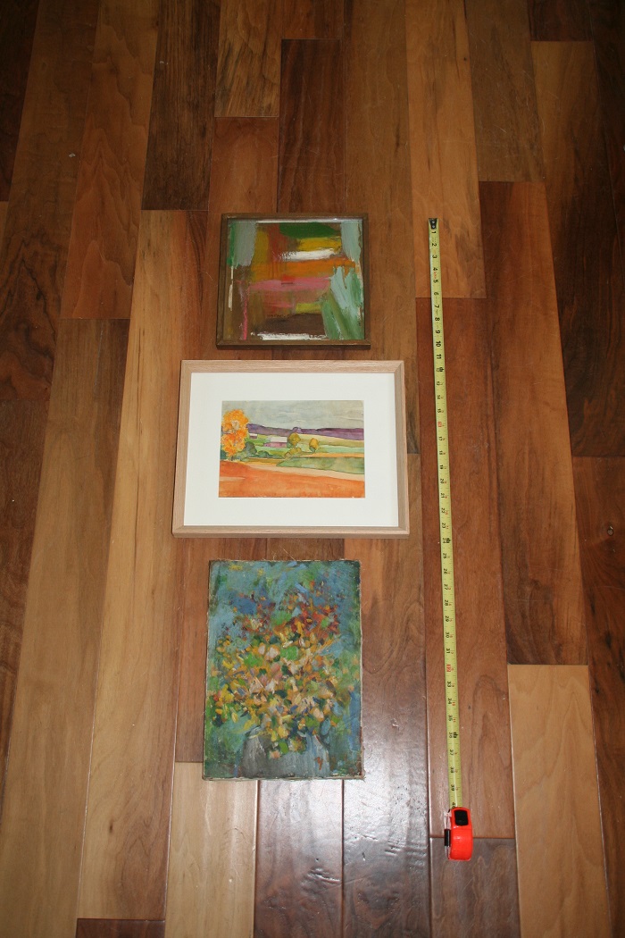 ABOVE: After laying them out on the floor the way I thought they should be, I took my tape out and measured from the top of the top painting to the bottom of the bottom painting. In this case, it was about 38″ including the space in between each painting, which was about 1.5″. This could vary greatly depending on the size of your art and the size of your wall. If these were bigger paintings in a bigger space I might leave as much as a 5″ space between paintings.
 ABOVE: I then placed my tape measure on my desk and let out some slack since I knew that the bottom painting wouldn’t actually be resting on the desk. I played around with it until I ended up with the top and bottom of the stack about where I wanted them, which meant that the bottom of the bottom painting was about 11″ above the top of the desk. Again, this could vary, but I thought that this looked best because it gave me a few inches between my printer and the art.
 ABOVE: a closer look. After I had played around with it, made adjustments, went back and forth fine tuning the placement between pieces lying on the floor, and how the overall height looked on the wall, I decided that I had it just right. I made a faint mark with a pencil at the top, then removed the tape measure. By the way, if it’s something that I want to think about and live with for a while, I’ll put blue painter’s tape on the wall, either marking the top and bottom of the grouping, or outlining each painting, until I’m ready to commit to start hammering nails. When in doubt, take your time. If you have never been on a serious photo shoot before you would not B E L I E V E how much time and effort goes into almost every single photo you see in a magazine. Note: when in doubt, hang things a little LOWER than you think you should because (1) another common problem I see is that people tend to hang art WAY too high, and (2) it’s much easier to go back and hang things higher rather than lower, because you won’t be dealing with as many extra exposed nail hole mistakes!
 ABOVE: I hung the first piece based on the top of the painting lining up with the pencil mark at the top of the tape measure. I first measured how far down the hanging wire on the back was from the top of the frame, (2″ in this case, but that could vary greatly), and put the nail 2″ further down from the pencil mark.
 ABOVE: I repeated the above procedure with the second painting, allowing for an extra 1.5″ of wall space between the two paintings.
 ABOVE: and finally, the same procedure, and same 1.5″ of wall space, for the third piece of art to be hung.
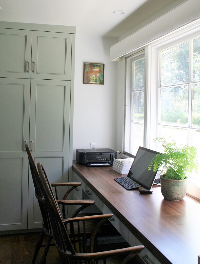
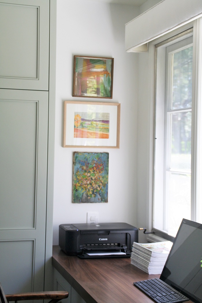
ABOVE: The final product, from a bit farther back in the room, which is how it looks in real life every once in a blue moon….after I’ve cleared off all the paperwork.
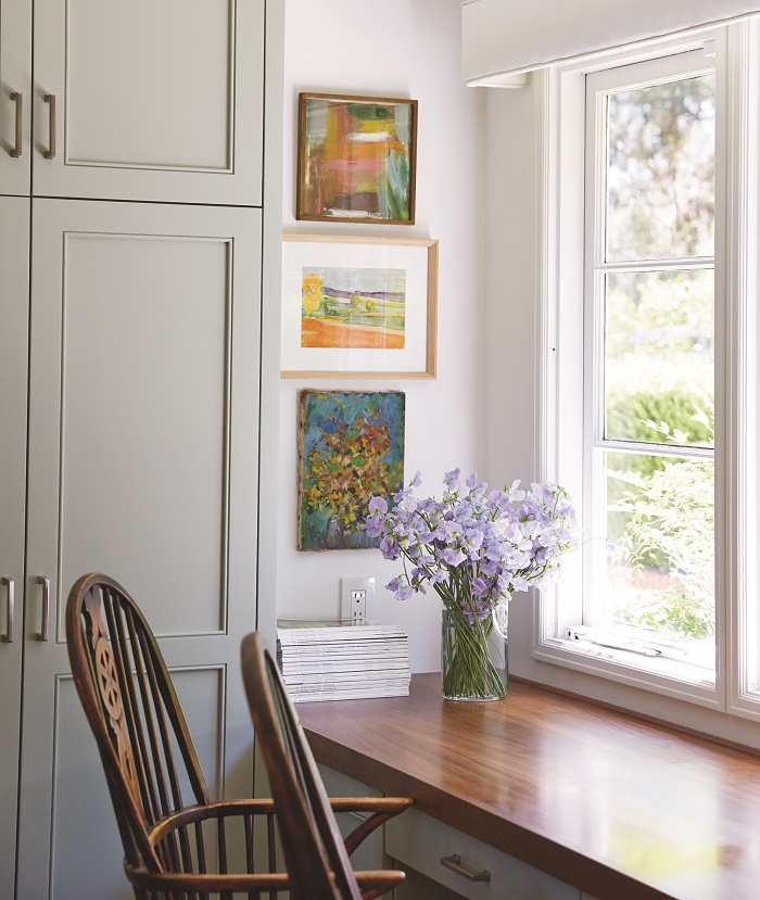
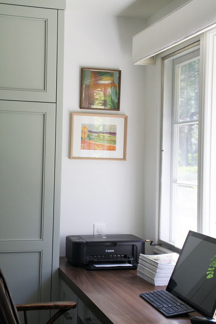
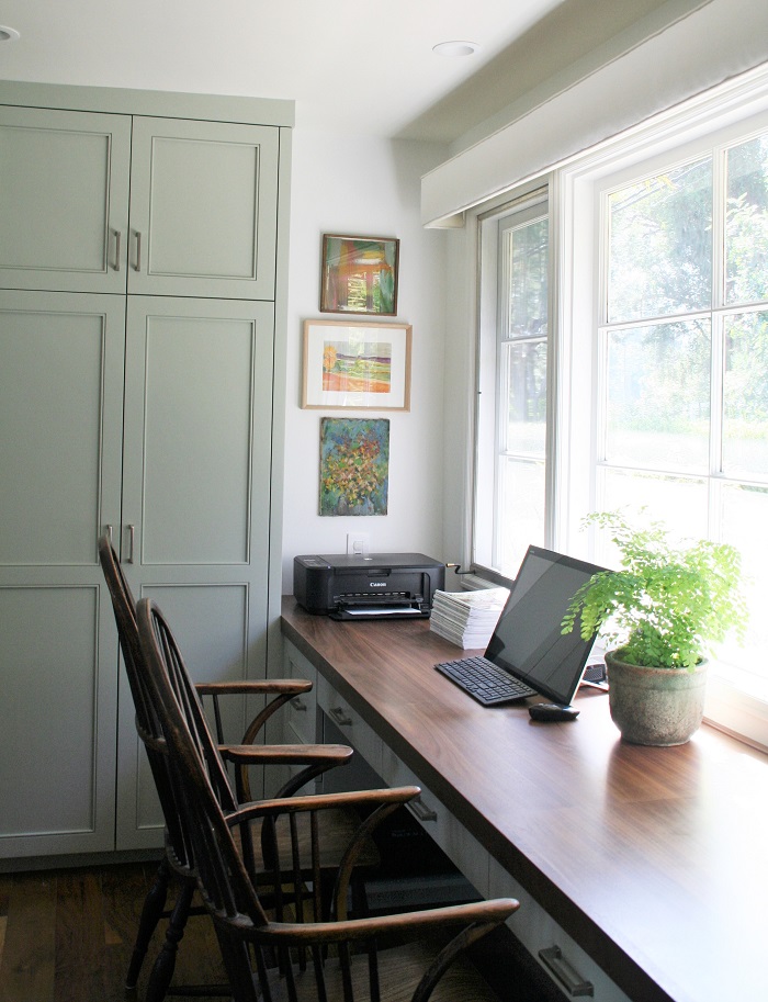
And, here is the final product, sans printer and computer for the purpose of getting a nicer photograph. All photos by me except for the last lovely one, which was taken by the professional Jen Siska.
I hope you found this information helpful! For instruction on other methods of hanging art, please view these blog posts: How to Create a Gallery Wall of Art , and A Step-by-Step Guide to Placing Art.
NEED DESIGN HELP? I HAVE A NEW WEBSITE TO TEACH PEOPLE HOW TO DO INTERIOR DESIGN FOR THEIR OWN HOMES! Visit PLAN + ELEVATE to watch video tutorials, download exclusive resources and tools, and sign up for a personal interior design video consultation where you can get specific questions answered about your own rooms.
I’m available for hourly interior design consultations or art consultations in person in the South Bay of Los Angeles: Palos Verdes, Redondo Beach, Hermosa Beach, or Manhattan Beach.
Let’s keep in touch!
- Follow me on Instagram
- Follow me on Facebook
- Follow me on Pinterest
- Follow me on YouTube
- Visit my blog menu to see more posts
- Sign up for my newsletter
And share this post by clicking the icons below. Good luck with your design projects!
Anna
in the press

in the press